ShopDreamUp AI ArtDreamUp


Suggested Deviants


Suggested Collections


You Might Like…


Comments2
Join the community to add your comment. Already a deviant? Log In
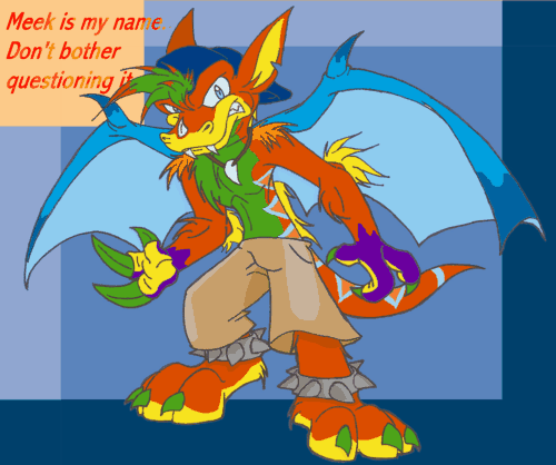
Where to start, where to start. This is simply an awesome pic in so many ways, and I don't want to miss telling you one.. but still without making it a HUGE rambing. Ok, I'll begin with the character himself, then move to pose and form, and end with colouring.
First of all, the very idea of naming him Meek was sheer genius, if you don't mind me saying (Wink)") Names usually compliment what the character is, or wants to be, like a thief could be named Hush, or a priestess Hope, but in your case, the name contrasts completely with him. He seems so feral and short-tempered, itching for a fight, and yet his name, Meek, represents those timid and weak. It's a good call because he really seems to be eager to fight, even when logic (and self-preservation), and I think it's because he's desperate to prove his name wrong. It's a great way to REALLY make him a troublemaker, for if your name is what you most loathe, it's like an eternal urge whipping you on and on with no end.
Names usually compliment what the character is, or wants to be, like a thief could be named Hush, or a priestess Hope, but in your case, the name contrasts completely with him. He seems so feral and short-tempered, itching for a fight, and yet his name, Meek, represents those timid and weak. It's a good call because he really seems to be eager to fight, even when logic (and self-preservation), and I think it's because he's desperate to prove his name wrong. It's a great way to REALLY make him a troublemaker, for if your name is what you most loathe, it's like an eternal urge whipping you on and on with no end.
The design is just awesome, you know. You have this toony art style that is (in my case) pretty enviable. It's just soo good, cute, and yet not overly so, with a fluid grace to the lines, and everything from expression to anatomy and pose caricaturized in a great way. I like his face, how you curled the lip and lowered the eyebrows to give him this snarling look (I swear that you can almost hear him growling). The muzzle is simply incredible, somewhere between canine and reptilian, with snakelike fangs.. all well proportioned, and those ears and tufts coming out of his cap... WOW. Great body, with a nice ammount of detail to show he's strong and athletic, but still keeping the cartoony style.. very well blended, and the pose itself is really good too. I like the hands and feet the most, problem areas of mine, particularly the feet. Cool is an understatement, wolfily digitigrade, with nice big toes... I really can't find the right words other than I really have no idea of the species.. he looks mammalian with that fur, reptilian with the colour pattern and fangs, and draconic with those wings and thick tail.
Colouring. First of all, my deepest admiration to you for the amazing colouring scheme you gave him. There's this uniformity that borders on chaos, splashes of bright colours all about that rusty fur. The stripes on his back and the greenish tone on his hair is just great, and how you used bright yellow on the muzzle and the inside of the ears, then repeating on the bottom of the feet and some tufts of fur. Green on the belly looks very cute, actually, there's something about bright stomachs that makes me think that way. The green claws were also a nice touch, they stand out quite nice against the purple and yellow. the triangular pattern on the back helps add uniformity, a stable piece from where you can notice that the colouration follows a design. Finally, the purple hands... where did you come up with it? It's awesome!!
Well I hope I didn't rant for TOO long.. but I just had to tell you how much I like this pic. First one on your gallery, and it just called for a comment.
Just one critique, if I may. The bronzey style on the letters is great, it matches well with the rusty fur.. but it kind of blends with the background in some places. Might I suggest giving them a small black border to solidify them?
First of all, the very idea of naming him Meek was sheer genius, if you don't mind me saying
Names usually compliment what the character is, or wants to be, like a thief could be named Hush, or a priestess Hope, but in your case, the name contrasts completely with him. He seems so feral and short-tempered, itching for a fight, and yet his name, Meek, represents those timid and weak. It's a good call because he really seems to be eager to fight, even when logic (and self-preservation), and I think it's because he's desperate to prove his name wrong. It's a great way to REALLY make him a troublemaker, for if your name is what you most loathe, it's like an eternal urge whipping you on and on with no end.The design is just awesome, you know. You have this toony art style that is (in my case) pretty enviable. It's just soo good, cute, and yet not overly so, with a fluid grace to the lines, and everything from expression to anatomy and pose caricaturized in a great way. I like his face, how you curled the lip and lowered the eyebrows to give him this snarling look (I swear that you can almost hear him growling). The muzzle is simply incredible, somewhere between canine and reptilian, with snakelike fangs.. all well proportioned, and those ears and tufts coming out of his cap... WOW. Great body, with a nice ammount of detail to show he's strong and athletic, but still keeping the cartoony style.. very well blended, and the pose itself is really good too. I like the hands and feet the most, problem areas of mine, particularly the feet. Cool is an understatement, wolfily digitigrade, with nice big toes... I really can't find the right words other than
I really have no idea of the species.. he looks mammalian with that fur, reptilian with the colour pattern and fangs, and draconic with those wings and thick tail.Colouring. First of all, my deepest admiration to you for the amazing colouring scheme you gave him. There's this uniformity that borders on chaos, splashes of bright colours all about that rusty fur. The stripes on his back and the greenish tone on his hair is just great, and how you used bright yellow on the muzzle and the inside of the ears, then repeating on the bottom of the feet and some tufts of fur. Green on the belly looks very cute, actually, there's something about bright stomachs that makes me think that way. The green claws were also a nice touch, they stand out quite nice against the purple and yellow. the triangular pattern on the back helps add uniformity, a stable piece from where you can notice that the colouration follows a design. Finally, the purple hands... where did you come up with it? It's awesome!!
Well I hope I didn't rant for TOO long.. but I just had to tell you how much I like this pic. First one on your gallery, and it just called for a comment.
Just one critique, if I may. The bronzey style on the letters is great, it matches well with the rusty fur.. but it kind of blends with the background in some places. Might I suggest giving them a small black border to solidify them?